Why 'neutral' doesn't have to mean beige
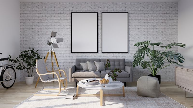
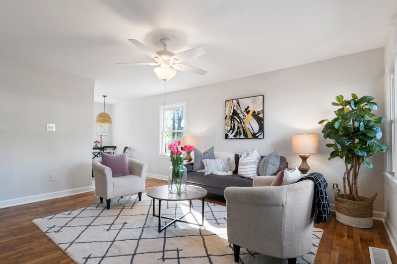
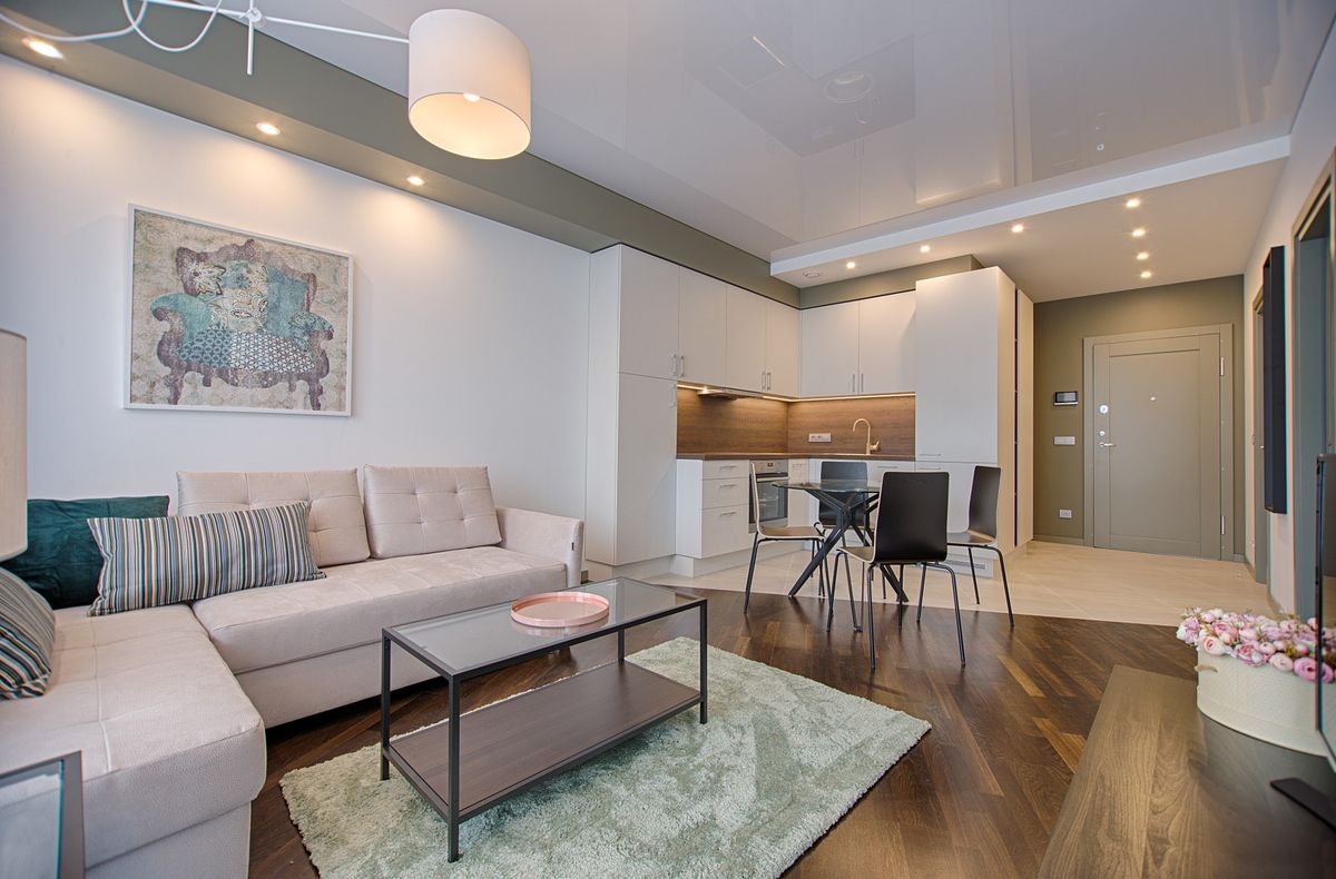
A neutral palette is really about low-saturation colors working together — which can include warm taupes, soft greens, greiges, and off-whites, not just tan and cream. The goal is a backdrop that lets furniture and light do more of the visual work.
Build from a dominant, secondary, and accent tone
Most successful neutral rooms use roughly three tonal layers rather than one flat color everywhere.
- Dominant (60%): walls and largest furniture piece, like a sofa
- Secondary (30%): rug, curtains, or a large accent chair
- Accent (10%): pillows, art, and small decor objects — this is where you can introduce more contrast
Warm it up with texture and materials
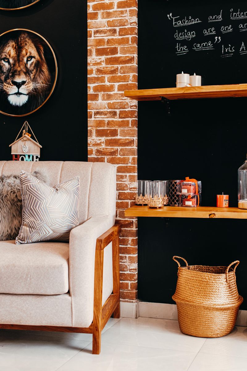
A common complaint about neutral rooms is that they feel flat or cold. Layering different textures — a nubby wool rug, a linen sofa, a wood coffee table, woven baskets — adds depth without adding more color, and is often the real fix.
Test paint and fabric in the actual room
Neutral colors shift dramatically depending on light exposure and the colors around them. Testing paint swatches and fabric samples in the room itself, at different times of day, avoids surprises after a purchase is final.